Showing posts with label CSS. Show all posts

Tuesday, 3 December 2013

Twitter bootstrap - for quick and easy design

If you're anything like me, for a graphics designer you make a great web developer.

My past attempts at design have run the gamut from "geocities" to "unicorn vomit", and I've become increasingly minimalist in an attempt to rectify that

-> less design == less unicorn-puke == win!

But it still leaves my sites looking like crayon-drawn whitesites

It's a long way from there to the current industry requirements of a clean, flexible, responsive design - able to handle mega-huge desktop-monitors and tiny smart-phones alike while looking sleek and professional... and I had resigned myself to basically just not sucking too badly and hoping my sites were useful enough for people to get past the ugly-duckling look.

but now I've found bootstrap. It lets you quickly and easily build a fully-responsive all-devices-ready design with very little graphic-design nous required. From a full grid-based system (to easily build columns that will nicely collapse on smaller screens), to all sorts of components - navbars, breadcrumbs, panels, lists of linked thumbnail images... the list is pretty huge.

Don't be put off by the "oh my god PURPLE" look of their website - this is a tool worth using.

The getting started guide is where to begin.

There's a number of pre-built templates on bootply templates that even if you don't like, you can cannibalise for the various pieces you want.

You can also buy a whole bunch of pre-packaged, professional themes (for about $12 each) from WrapBootstrap to kickstart your website design. Though be aware they are mostly built on Bootstrap 2

If you're building this stuff in rails, there's a whole bunch of bootsrap-related gems - which mean you don't have to download the css/js versions of bootstrap and mix them all into your assets directory.

Ryan Bates' railscast (see below) uses seyhunak / twitter-bootstrap-rails, which seems to have a whole bunch of neat generators for quickly throwing up layouts. I prefer not mixing bootstrap's Less with the existing SASS, and so have gone for the sass-based gem: bootstrap-sass gem.

I suspect you can combine these two powers for good by using the generators of twitter-bootstrap with the sass-based assets of bootstrap-sass... but have yet to try it (let me know if you do).

There's also a great overview of rails and twitter bootstrap with a related RailsApp that goes into far more depth (I haven't had a look at that yet).

and Ryan Bates has done a railscast on twitter bootstrap basics, and a pro-only railscast: more on twitter bootstrap

enjoy...


Note: Bootstrap version 3 has recently been released, and a lot of the tutorials, railscasts etc are based on version 2. Bootply has a Bootstrap 3 migration guide if you want a reference to what has changed.

Tuesday, 15 July 2008

Little boxes, made of errors...

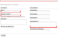
The standard styling for error boxes (at least with v1.2.6) looks ugly as per below.

Screenshot - old FieldWithErrors

The red doesn't go all the way around the actual box for form fields. Yuk! This is a result of the field in question going into a span that is styled - not the actual form field. Stylesheet code as below:

.fieldWithErrors {
  border: 2px solid red;
  background-color: red;
  padding: 2px;
  display: inline;
}

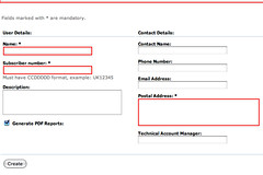
To make it look neat and pretty (as in the below image), use the following code instead:

.fieldWithErrors input, .fieldWithErrors textarea, .fieldWithErrors select  {
  border: 2px solid red;
  display: inline;
  padding: 2px;
}
Screenshot - new FieldWithErrors

Tuesday, 12 June 2007

Super Cool Smart Column Sorting

So, I wanted to drop in some basic column sorting without having to rip out the innards of something like streamlined. I googled and came across this blogpost on SCSCS - which is so worth it for super-cool simple column sorting...

But I'm just not satisfied by what it can do. As ever, I want more. In this example, I wanted to be able to display neato little up/down arrow widgety thingies on the column heads by giving the th the appropriate "up/down" class - so the user can see which column it's all sorting by.

Arrowy goodness

We want a way to stuff a CSS class into the table's column-heads so we can show the sorty arrows. We need to indicate two things. Firstly, when the data has been sorted by a particular column, we want to indicate "this is the current sort colum". Secondly, we want to be able to indicate the sorting direction of a column (up, down or indifferent).

So the first step is to create (or appropriate) arrow-images. I'm not going to show an example here (you can figure that out for yourself) but I'll assume you have three images: SortUp.gif, SortDown.gif (to show that the current column is sorted up or down), and SortAny.gif (a double-arrow to indicate that the column could be sorted if they want to).

Stylish stuff

Then you need to put something appropriate in your stylesheet. eg:

/* what an ordinary column-head looks like */
.dataTable th {
   background-color: grey;
   color: white;
   padding-left: 15px;
   padding-right: 4px;
}
/* colour for currently sorted column */
.dataTable th.current {
  background-color: black;
  color: white;
}
/* the sorting link */
.dataTable th a {
  color: white;
  text-decoration: none;
  display: block;
  width: 100%;
}
.dataTable th.current a {
  color: grey;
}
/* pretty colours when hovering */
.dataTable th a:hover {
  color: blue;
  background-color: grey;
}
.dataTable th:hover {
  background-color: grey;
}

/* display of up and down arrows for sortable columns */
.dataTable th.up {
  background-image: url("/images/SortUp.gif");
  background-repeat: no-repeat;
  background-position: center left;
}
.dataTable th.down {
  background-image: url("/images/SortDown.gif");
  background-repeat: no-repeat;
  background-position: center left;
}
/* display for "any" sort - eg up and down arrows */
.dataTable th.any {
  background-image: url("/images/SortAny.gif");
  background-repeat: no-repeat;
  background-position: center left;
}

Stuff to note:

  • The "current" column head is a distinctively different colour to a normal column - this makes it stand out.
  • The "hover" colours provide good feedback for users - they pick up the idea that clicking here will probably do something.
  • The anchor within the column head has display:block; and width:100%; this makes the anchor stretch to the full width of the column-head - which is nicer than having to click just the word itself.
  • There's a padding-left on the anchor columns - this gives room for the arrow images. I've specified 15px as it's big enough for the images I use - YMMV.

Classy heads

So now we need to adapt the sort_link method to make it actually use this stuff. But we don't want it just on the link - the class needs to go on the whole column-head. So write a wrapper-function that will generate the whole <th> for you (class and all):

  # generate appropriate class for current sort options
  def sortlink_class(col)
    return "any" unless params[:col] || params[:dir]
    return "current #{params[:dir] == 'up' ? 'up' : 'down'}" if params[:col] == col.to_s
    "any"
  end

  # Generates a column head tag that contains a sort link and is given the
  # appropriate class for the current sorting options.
  def column_sort_link(title, column, options = {})
    content_tag 'th', sort_link(title, column, options), 
                      :class => sortlink_class(column)
  end

  def sort_link(title, column, options = {})
    if options.has_key?(:unless)
      condition = options[:unless] 
      options.delete(:unless)
    end
    new_sort_dir = params[:dir] ==  'down' ? 'up' : 'down'
    link_to_unless condition, title, request.parameters.merge(options.merge(:col => column, :dir => new_sort_dir))
  end

So, the currently sorted column will get something like class="current up", wheras most of the columns will be class="any". You'll also note I updated the badly-named "d" and "c" to "dir" and "col" so that unsuspecting maintenance people might have a clue as to the actual purpose of the options. Self-documenting code being a Good Thing.

Finally, I've modified it to pass through any extra options to the controller by merging the options into the link. This can be used to pass through requests for special sorts, extra parameters etc.

Tuesday, 6 March 2007

Sliding Doors tabbing in Rails

So I wanted to find a way of doing tabbed navigation in Rails for my own website. Naturally I asked Aunty google for help, who came up with many links to this article on tabnav. It looks pretty neat and I had a play with it. It is pretty easy to set up and works quite nicely *however*, it automatically puts, not only the tabs, but the page-content div into the page as well. This means you have to jigger with the css and can't just use the tabs (without the content div) if you don't wish to.

I also really like the classic Sliding Doors CSS look. So I decided to carve my own path in the bush, so to speak. I plan to clean it up a bit and turn it into a generator/plugin of my very own. For now, here are the lumps o' code I used to get it working together.

Sliding Doors styles

This is the standard set of sliding doors styles taken almost directly from the tutorial (and tweaked a little for the images I'm using). Clearly you also need the proper images - have a look at the tutorial for what's needed here.

/* these are used for dHTML positioning and style of tab menu. Much of this
 * was taken from "A list apart"s article on the "Sliding Doors technique".
 * http://www.alistapart.com/articles/slidingdoors/
 * This is an amazing article and well worth the read.*/
#header {
  /* the tab div needs to match the page background */
  background: #38cbff url(http://example.com/page_bg.png) top left repeat-x;
  
  float:left;
  width:100%;
  font-size:85%;
  line-height:normal;
  margin: 0px 0px 0px 110px;
  padding-right: 30px;
  border-bottom: 2px solid;
}
#header ul {
  margin:0;
  padding:5px 0 0 0;
  list-style:none;
}
#header li {
  float:left;
  background:url("/images/ButOffRight.png") no-repeat right top;
  margin:0;
  padding:0 15px 0 0;
}
#header a {
  float: left; /* one half of IE5 hack */
  display: block;
  background: url("/images/ButOffLeft.png") no-repeat left top;
  padding: 10px 0px 5px 15px;
  text-decoration: none;
  font-weight: bold;
  color:#fed;
}
#header a:hover {
  color:#fff;
}
#header #current {
  background-image:url("/images/ButOnRight.png");
}
#header #current a {
  background-image:url("/images/ButOnLeft.png");
  color:#222;
  padding-bottom:5px;
}

/* Commented Backslash Hack
   hides rule from IE5-Mac \*/
#header a {float:none;}
/* End IE5-Mac hack */

/* IE6 hack for padding around tabs */
* html #header a {padding: 0px 0px 5px 15px;}

Layout item

I kept the tabs in a partial template so they could be shared by multiple layouts (if necessary). Standard Rails practice puts shared partials into /app/views/shared Thus, to pull the tabs into the layout requires:

<%= render :partial => 'shared/tabs' -%>

Tab helper function

Each tab is generated using this helper. It creates the list item given the name and preferred link options, hilighting the tab if the user is on the actual page already. I'm tossing up whether to allow highlighting even when your on the main page of a group of pages - it's a GUI question that has pros and cons.

    def make_tab(t)
    # creates a navigation tab out of the given information.    
      tab = "<li"
      tab << ' id="current"' if current_page?(t[:options])
      tab << '>'
      tab << link_to(t[:name], t[:options])
      tab << '</li>'
      tab
    end

Tabs partial template

This bit is probably the messiest part. I'm just using a temporary variable to hold the tabs here - it should be passed into the partial, so the partial can be re-used with different tab-sets (right now I only use one, so it doesn't matter). Later I plan to make a Tab class and have a standard set of tabs loaded from a config file. This standard set can then be added-to or overridden just like columns in the AJAX scaffold.

<div id="header">
  <% tabs = [{:name => 'home', 
                :options => {:controller => :home, :action => :index}},
             #{:name => 'portfolio', 
             #   :options => {:controller => :portfolio}},
             {:name => 'resume', :options => 'resume.pdf'},
             {:name => 'blog', 
                :options => 'http://rubyglasses.blogspot.com/'},
                ] -%>
      
  <!-- tabbed browsing of main site areas --> 
  <ul>
    <% tabs.each do |t| -%>
      <%= make_tab t -%>
    <% end -%>
  </ul>
</div>

Sunday, 3 December 2006

Kill the ugly duckling!

For years, now, I've had a "tradesman's website"... you know, how the tradesman comes home and doesn't want to do *more* work, so they let their own house go. That's what my website has been like now for a while. I've suffered brief bouts of inspiration, followed by a flurry of new stuff - only to get caught up in what I was doing at work and not want to do any web-development once I got home :P

But that's gotta change - and the old styling is really not cutting it for me. So the first thing I've done is to get some graphic desgin done... I'll be getting the first look at the result on Monday and have been really looking forward to it!

I've never had to brand myself before, and that's essentially what I'm doing. I've worked with branding for products, companies and services, events and concepts - but never for myself. I had a chance to chat about what I like, how I see myself being portrayed and even a few of my favourite hobbies (eg calligraphy) and now I'm really looking forward to the results.

Monday, 20 November 2006

Fixed-width suffocation

This blog was getting strangled by its own fixed width. Yick. So I've just updated the layout CSS to remove the set-pixel-width sections. Unfortunately this also required mucking about with the background images (quick application of gimp and an upload to my own website). The parchment background doesn't look quite so pretty without its "slightly burnt" edges - but at least it won't repeat said edges over and over.

If I get more inspired later I'll update the layout to include the left/right edges individually. Right now I don't have the brain-space to figure out how do that in an elegant way.